
Typografie auf Designerniveau
Auf der Büttenkarte stehen Name, Datum und Ort sauber in einem doppelten Rahmen, darunter liegen eine kleinere Karte und ein mit Siegellack verschlossener Umschlag. Jedes Wort ist korrekt geschrieben, und die Prägung bleibt im Papier sichtbar.
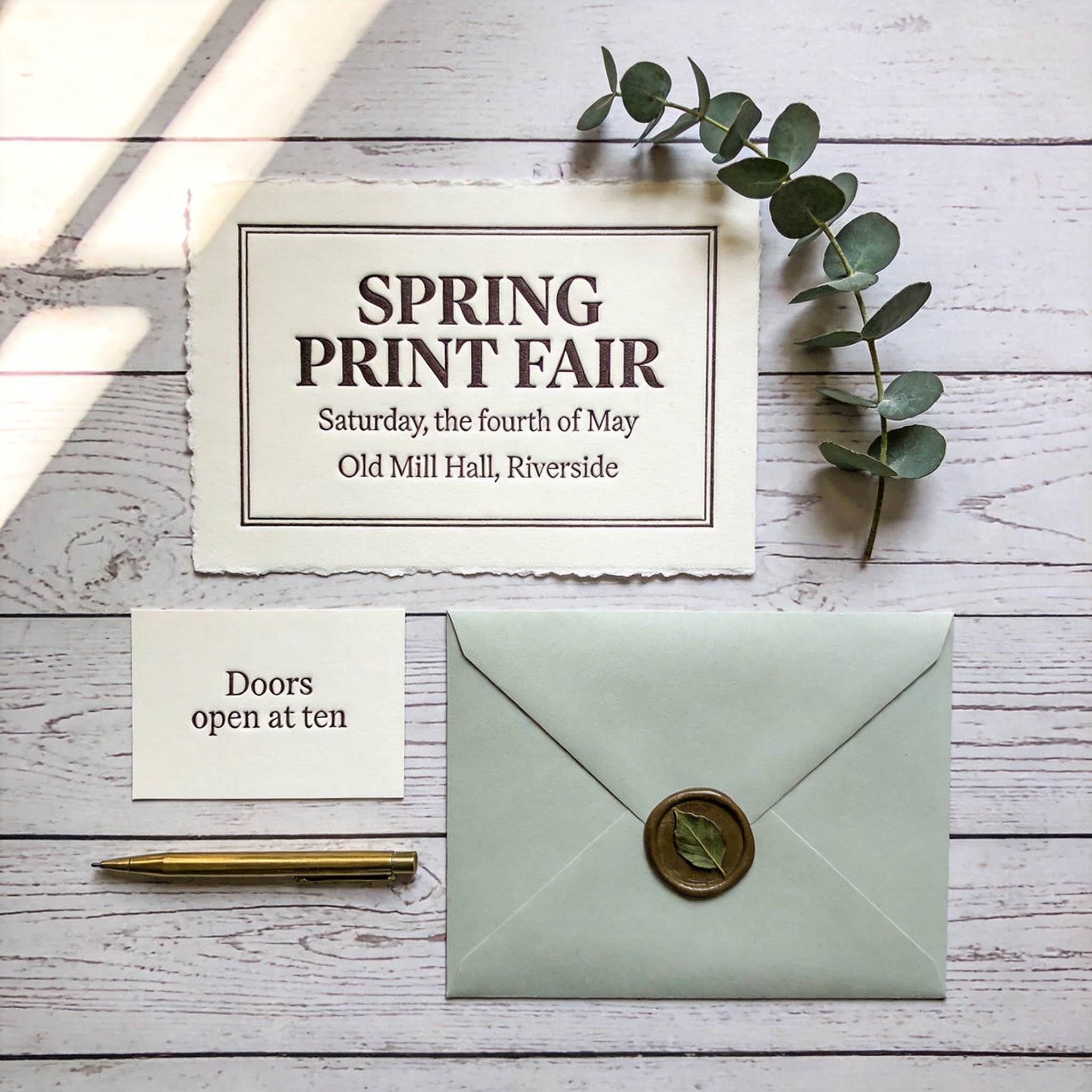
Overhead flat lay of a letterpress stationery suite for a fictional spring print fair, on a whitewashed wooden tabletop, square composition. Main card: a thick cotton card with deckled edges, the words "SPRING PRINT FAIR" in a large deep-impression serif, beneath them "Saturday, the fourth of May" in small caps, and a lighter third line "Old Mill Hall, Riverside", all text fully inside the card with even margins. Below it a separate smaller card reading only "Doors open at ten", and a pale sage envelope closed with a wax seal pressed with a single leaf. Props: one sprig of eucalyptus, one brass pen. Soft window light from the left, gentle shadows, visible letterpress impression and cotton paper fiber. Shot straight down, 50mm lens look, everything in focus. No extra text, no logos, no watermark.